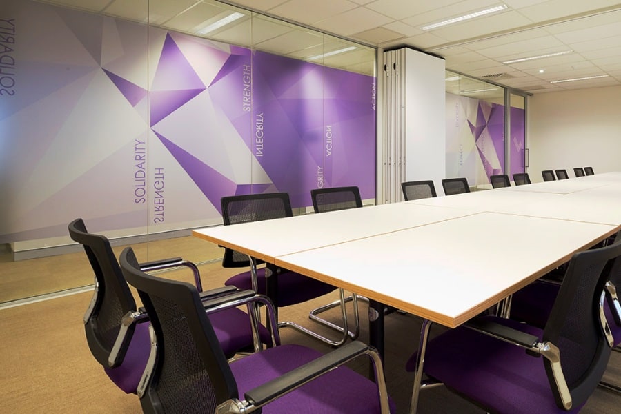
There has been a long-lasting debate as to whether colour has the ability to impact our productivity, mood and overall wellbeing. To accept that colour is the sole contributor to these factors is unrealistic, however it undoubtedly creates an impact (1). This not only applies for contemporary psychology, but has also become significant for interior design (2). The use of colour is certainly subjective. Nonetheless, it is useful for a business to initially establish how they want their interior to make people feel and behave, appreciating how colour can assist them in doing so.
Contemporary TrendsCurrently, it is common for companies to request a clean and neutral interior with frugal use of colour. This may be attributed to a number of factors, a prevalent reason being to ensure interior longevity. While this is understandable, it is imperative for companies to consider how the lack of colour will affect the psychological element of their space. Studies have shown that offices with dominating use of grey, white and beige induce negative feelings, particularly in women (2).It is vital to remember that your brand comes first (3). An enduring trend is the reflection of company corporate colours throughout a design. This empowers branding and naturally introduces colour into the space. As Sonia Bucksteg (Dulux Colour Specialist) states; “businesses should always consider the use of colour to promote a positive image, as well to establish an environment where people will prosper” (1).

The relationship between colour and human behaviour has been widely researched throughout history. An early documented study took place in 1979 by Schauss. It was discovered that by painting the walls pink in American prisons, hostile inmate behaviour notably deceased. The findings became widely recognised, considerably so that prisons all over the US and Canada began to adopt this strategy (1).
It is beneficial to research companies of similar calibre or business nature and see how colour may have impacted their workplace. It is reported that Google studied the specific use of colour throughout their offices. They interestingly concluded the colour purple had a negative impact on employees (1). This has been further supported in workplace studies claiming that purple was uninspiring, particularly amongst males (2).

Different colours certainly produce different effects. Just to complicate matters even further, there are a number of contradictory reports. Yellow is said to be the colour of optimism and creativity, yet is also said to become draining (2). Red can be stimulating and ideal in activating passion, yet can also generate anger (3). It is wise to allocate colours accordingly to areas where they produce their best predicted effects (2). Nature based colours such as blues and greens are evident favourites. Blue is highly regarded for its calming and authoritative abilities. Green is said to promote thinking and provide an invigorating energy (2).

There is no correct choice of colour for a workplace environment. A dull space will exhaust employees, yet vivid colours can distract and distress (3). The best results will be achieved through balance. Essentially, it is about producing a setting to suit your business and value your visitors, as well as inducing an optimistic and inspiring atmosphere for your employees (2).
1. http://www.interaction.uk.com/insight/workplace-colours-impact-on-productivity-wellbeing/ 2. http://www.strategyhat.co.uk/blog/the-power-of-colour-in-office-design 3. http://cafecultureinsitu.com.au/blog/guide-colour-workplace-design-2/
